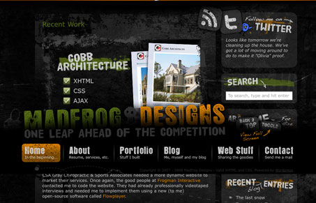
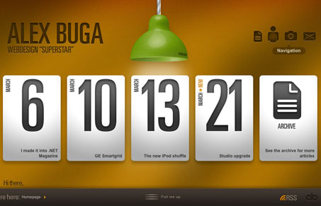
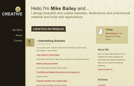
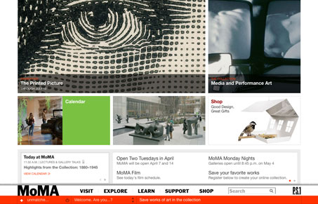
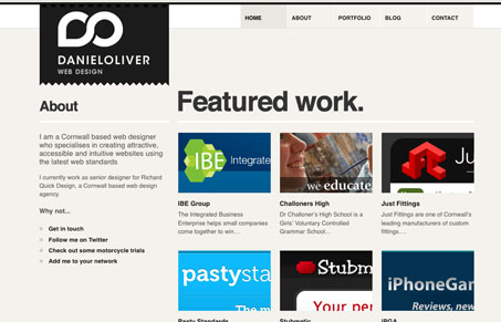
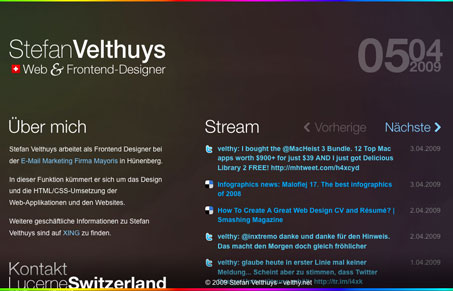
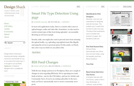
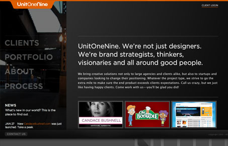
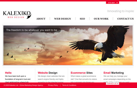
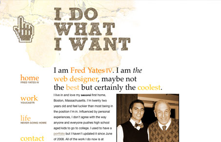
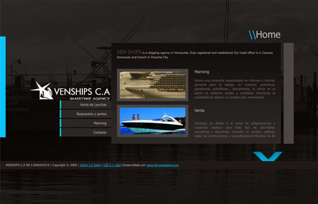
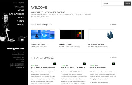
We’ve been coming across more and more websites with a static footer or navigation lately. Some are done really well and look quite elegant. Takes me back to the days of frame-sets *cringe* but the effect is kind of interesting. Some of these use the effect very subtly while others use it to make a strong visual point. Maybe you’re looking to use something like this in your next project or find some inspiration from the list we’ve pulled together there.
Glassmorphism: The Transparent Design Trend That Refuses to Fade
Glassmorphism brings transparency, depth, and light back into modern UI. Learn how this “frosted glass” design trend enhances hierarchy, focus, and atmosphere, plus how to implement it in CSS responsibly.







0 Comments
Trackbacks/Pingbacks