
Design trends may cycle, but bold minimalism isn’t a “new” idea, it’s a revival. You’ve likely seen it splashed across Behance, used in branding refreshes, or highlighted in recent UI/UX showcases. Big fonts. Sharp contrast. Heavy-weight typography dancing with loads of white space. This aesthetic is making waves again, but let’s be clear: we’ve met this style before.
So, What Is Bold Minimalism?
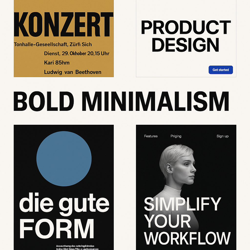
At a glance, it’s a mash-up of two seemingly opposing forces: the loudness of bold design elements and the restraint of minimalism. Think oversized headlines, high-contrast color palettes, brutalist-inspired layout structures, and stripped-down UI patterns where every pixel earns its place.
It’s minimalism without meekness. Where old-school minimalism whispered, this one speaks with presence. No clutter. No fluff. Just a few select elements, turned up to 11.
In UI, that might mean thick type, monochrome interfaces, massive buttons, or even entire hero sections with nothing but two colors and one punchy word. In print, you’ll see generous margins paired with heavy slab serifs or geometric sans fonts. In motion, it’s often stark, snappy, and unapologetically abrupt.
Why It’s Trending Again
The appeal is obvious: clarity, speed, impact. Bold minimalism delivers a visceral punch that resonates well in scroll-heavy feeds and short attention spans. It’s UX with visual attitude. For brands, it conveys confidence. For users, it cuts through the noise.
It also rides the line between brutalism and modern elegance. And right now, that tension is exactly what designers and clients want: something clean that still demands attention.
But Let’s Be Real, This Isn’t New
Before we crown bold minimalism as the future, let’s acknowledge its past.
We’ve seen this story unfold before. In the 1960s, Swiss Style design did this with grid systems and sans-serif purity. In the early web, Flash intros (yep) occasionally flirted with it in monochrome madness. Then came Apple’s “Think Different” era: stark photography, Helvetica, and wide-open white space.
Even in the early 2010s, agencies like Sagmeister & Walsh and design systems like Google’s Material Design leveraged bold simplicity, big type, vivid color, ruthless space economy.
So no, bold minimalism isn’t “new.” It’s just resurfaced, sharpened by modern tools, screen sizes, and digital expectations.
Swiss Style Elements That Echo in Bold Minimalism
Swiss Style also known as the International Typographic Style, is basically the original playbook for bold minimalism. It emphasized clarity, order, and function using a limited visual vocabulary. Here’s how Swiss Style directly relates to and laid the foundation for what we now call bold minimalism:
Large, Grid-Based Typography
- Then (Swiss): Designers like Josef Müller-Brockmann used tight grid systems with asymmetric layouts and sans-serif typefaces (e.g., Akzidenz-Grotesk, Helvetica) in bold weights.
- Now (Bold Minimalism): Oversized, high-impact typography drives modern interfaces and branding. Grids are still present but used more flexibly, sometimes even exaggerated.
Example: Müller-Brockmann’s concert posters (1950s) used massive type with generous negative space. Today, you’ll see similar layouts in product hero sections on sites like Stripe or Apple.
Minimal Color Palettes with High Contrast
- Then: Swiss designers typically used black, white, red, or blue, often in flat color blocks with sharp delineation.
- Now: Bold minimalism does the same, black-and-white dominance with a splash of accent color, often for CTAs or micro-interactions.
Example: The use of one accent color (like electric blue or blood red) in an otherwise monochrome layout is directly descended from Swiss color discipline.
Photography as Function, Not Decoration
- Then: Swiss Style incorporated stark, high-contrast photography aligned to grid systems, always in service of the message.
- Now: Bold minimalism uses full-bleed images or portraits with clean typography layered on top, stripped of decorative excess.
Example: Any modern SaaS website using hero images with 2-word headlines and minimal nav—very Swiss in spirit.
Negative Space as a Power Tool
- Then: Swiss designers let their work breathe, often leaving large parts of the canvas untouched.
- Now: Bold minimalism thrives on that same principle, space isn’t just empty, it amplifies what remains.
Example: The identity for brands like Aesop, Spotify Design, or even Notion relies on negative space to direct focus and create mood.
Sans-Serif Typography and Functional Messaging
- Then: Helvetica was born in this era—not for style points, but because it was readable, clean, and non-distracting.
- Now: We’re seeing a renaissance of grotesk sans-serifs, sometimes custom-drawn, being used for branding and UI. It’s less “vintage” and more “assertive clarity.”
Example: Look at brands like Figma or Framer—massive grotesk headlines, tight kerning, and no-frills delivery.
Swiss Style wasn’t about being trendy. It was about visual honesty and communication. Bold minimalism borrows the same discipline, strips away the nostalgia, and reloads it with digital edge.
What Bold Minimalism Means for You
If you’re designing for clarity, punch, or brand presence, this is your jam. But it’s also a reminder that strong ideas don’t need clutter. Minimal doesn’t mean soft. And bold doesn’t mean busy.
Use bold minimalism when:
- You want your message to land fast.
- Your audience is mobile-first and scrolling past a sea of sameness.
- You’re working with short attention spans but still want to leave a mark.
- Your brand needs to look premium, but not sterile.
Avoid it when:
- Your product requires dense explanation or layered storytelling.
- You’re relying on subtlety or emotional nuance.
- Your brand doesn’t have the guts to be loud and clean at the same time.
Bold minimalism isn’t a revolution, it’s a reminder.
The strongest design trends often aren’t inventions but reinventions. It’s about knowing which tools to bring forward and how to sharpen them for this moment.
The trick? Don’t just jump on the trend. Make it yours. Own the tension between minimal and bold, and know when to push, and when to pull back.


0 Comments