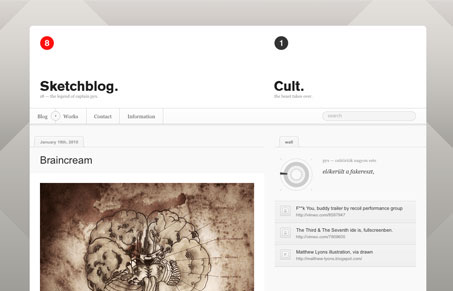
Illustrations aside (which are badass) this is a really nice looking blog design. I love the angles used in the background played against the white shape of the blog itself. That navigation is interesting, with the arrow in the circle opening up the categories. The blog itself is really simple and standard blog design, it’s just the little things here and there that make it special.
Glassmorphism: The Transparent Design Trend That Refuses to Fade
Glassmorphism brings transparency, depth, and light back into modern UI. Learn how this “frosted glass” design trend enhances hierarchy, focus, and atmosphere, plus how to implement it in CSS responsibly.


0 Comments