Via @TrentWalton
Yes! @Yarcom is responsivized! http://yaronschoen.com/articles/re_did_my_site_again/
& @Beep
Look at that hot shit right there. Go @Yarcom!
More from @TrentWalton
I think my favorite bit is the work page, with its badass tappable next/prev nav: http://yaronschoen.com/work/charity_water/
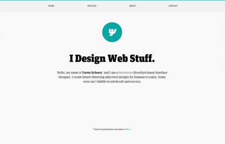
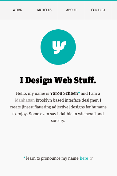
There’s a lot to love on this site. The initial buzz I saw about the redesign was that it’s a responsive site, but there’s so much more. There seems to be a lot of careful consideration and attention to detail, which leaves the site beautifully tailored and elegant. Yaron has managed to present things cleanly and minimally yet still represent a good bit of his personality. Everything from the helpful “learn to pronounce my name” page (which features a lovely use of Lettering.js) to the witty personal tone inserted into the copy in various places.
I love how the work section has a different accent color on each page that correlates to the project/brand it’s highlighting. The work descriptions are succinct but informative and the rest of the page is filled with large, gorgeous screenshots. Each button and link has a nice subtle interaction and in some cases a little fun (See the Home nav rollover on the internal pages) and the large social buttons on the About page, are just plain sexy.
There’s a lot of interest in this site on its own, aside from the stellar work that Yaron creates. You find a lot with designers that their own sites are never finished. Whether it’s just not good enough for them or it’s a place to experiment. One thing’s for sure, it’s always awesome when a designer shares some of their thought process and you then get to experience some of the evolution along with them. Check out Yaron’s post about the redesign, and follow along for the ride. Better yet, be inspired and go do!


Previous was far superior in showing your skills Yaron but I see the reason why the re-design. Good job!