
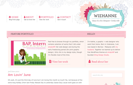
I like the line work in the illustrative logo. The elements used across this site have style. Overall it works as a blog theme, seeing as how it looks like she designs themes it makes sense. I think this design is perfect for the subject matter and executed well.




This is very… competent. It’s all done very well, the type is laid out well, the colors are nice. The problem is that it comes across as very generic, it’s full of the types of design elements (the little wrap-around ribbon things, the line illustrations) that I’ve seen all over the place. It’s not that they’re ugly or poorly done, I guess I’m just tired of seeing these things.