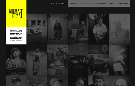
Really cool looking layout. I like the dark and yellow working together like this. The way the mouse over on the photos works is a nice touch too. The sub pages’ content gets kind of lost with the dark background I think but it all goes together style wise.
Glassmorphism: The Transparent Design Trend That Refuses to Fade
Glassmorphism brings transparency, depth, and light back into modern UI. Learn how this “frosted glass” design trend enhances hierarchy, focus, and atmosphere, plus how to implement it in CSS responsibly.


0 Comments