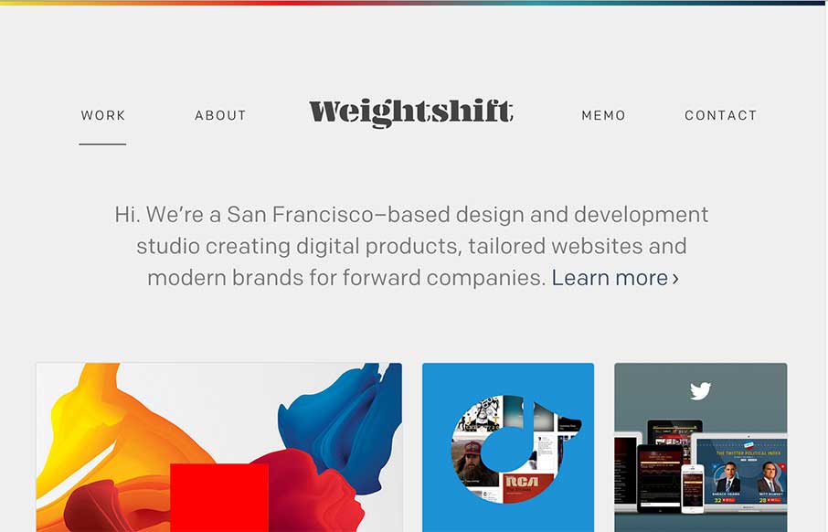
Every now and then Weightshift will rework their website. I’m in love with this version for sure – not that the past dozen were not good by any stretch. I love simplicity and the way this site has traveled down that path over the years is a work of art. Luuurrve this site.
Glassmorphism: The Transparent Design Trend That Refuses to Fade
Glassmorphism brings transparency, depth, and light back into modern UI. Learn how this “frosted glass” design trend enhances hierarchy, focus, and atmosphere, plus how to implement it in CSS responsibly.


0 Comments