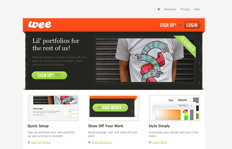
Nice looking simple online portfolio app. I love the simplicity of this design, they really could have gone over the top with it but really showed some constraint here. Love the colors, the red really shines on top of the grays and flat background, and the slight textures on the sides of the main feature box/area really works well. The signup page is also really well done and clean.
Glassmorphism: The Transparent Design Trend That Refuses to Fade
Glassmorphism brings transparency, depth, and light back into modern UI. Learn how this “frosted glass” design trend enhances hierarchy, focus, and atmosphere, plus how to implement it in CSS responsibly.


Excellent Website , Great one