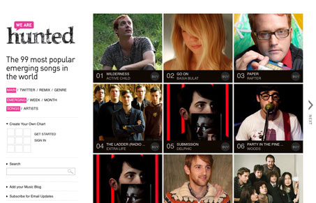
This is a great website. It’s deceptively simple. There are lots of little interactions that appear hidden at first look on this site that are actually quite deep and fun to use. The main grid of images of the musicians is straight forward enough, but the next and audio play bar is so very nice. The nav/sidebar down the left side is also subtle and chock full of interactions. Really spend some time here and see for yourself.
Glassmorphism: The Transparent Design Trend That Refuses to Fade
Glassmorphism brings transparency, depth, and light back into modern UI. Learn how this “frosted glass” design trend enhances hierarchy, focus, and atmosphere, plus how to implement it in CSS responsibly.


0 Comments