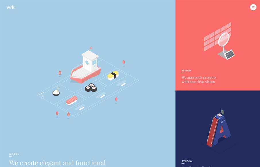
Holy moly, the Waaark site is brilliantly designed, visually. I love all the transitions and detail work with the illustrations. It’s very very unique and you get the vibe of a high end solutions firm here. That said, the transitions in some ways leave me feeling like I’m not sure that I’m actually on a new “page” – what are pages these days anyways, but the feeling is still there. I dig almost every part of this site design though. Brilliant visual work.
Glassmorphism: The Transparent Design Trend That Refuses to Fade
Glassmorphism brings transparency, depth, and light back into modern UI. Learn how this “frosted glass” design trend enhances hierarchy, focus, and atmosphere, plus how to implement it in CSS responsibly.


0 Comments