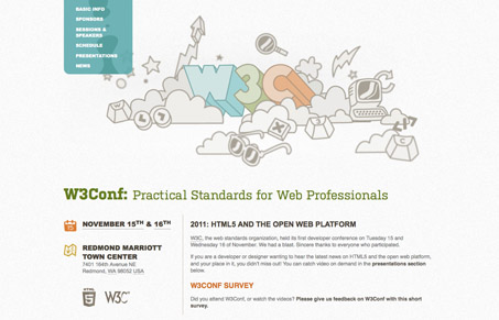
Nice responsive layout for the 2011 W3C Conference site. I enjoyed that main graphic and how it follows your mouse back and fourth, it kinda makes that top part of the site stand out and kind of memorable. It’s a really straight forward conference website being a single pager like it is. The grid is clean and feels kind of dynamic too which works well for the content. Good site!
Glassmorphism: The Transparent Design Trend That Refuses to Fade
Glassmorphism brings transparency, depth, and light back into modern UI. Learn how this “frosted glass” design trend enhances hierarchy, focus, and atmosphere, plus how to implement it in CSS responsibly.


0 Comments