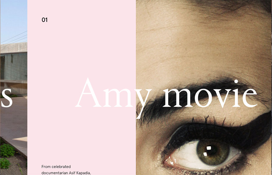
This website for the VO2 Group is pretty powerful in it’s imagery and overall interactions. It harkens me back to the days of flash sites pretty hardcore, but I still love it. The interplay from the home page to the longer scrolling project pages are pretty cool. It could definitely stand some work on the mobile screen widths execution though.
Glassmorphism: The Transparent Design Trend That Refuses to Fade
Glassmorphism brings transparency, depth, and light back into modern UI. Learn how this “frosted glass” design trend enhances hierarchy, focus, and atmosphere, plus how to implement it in CSS responsibly.


0 Comments