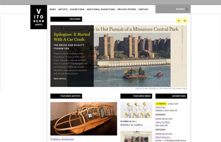
Vitoschnabel.com has a nice minimalist graphic style that does a pretty cool job of using yellow and black. Its not a really common palette and I think that in this case, it looks sophisticated. The interactions are fairly simple, its basically an information site, but the little touches are nice. The fixed header never feels out of place, no matter where you stop scrolling. The simple lines and sharp edges just fit at any scroll height. The massive drop-down works; the fast animation is enough movement to inform the user that something significant has occurred and the list that appears, while it feels more like a page element that a nav list, is intuitive enough. I only find two interactions that could be problematic with the nav. First, the drop-downs have a fixed height and require pagination within the drop-down. I find this problematic. The second is that the nav elements with drop-downs go nowhere. Perhaps if they went to a static page of all the drop-down links and short descriptions of the subpages then it would work a little better.
Still, its a really nice site and it didn’t take me long to discover how to use the awkward bits.


0 Comments