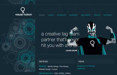
Submitted by Eric Carroll, @visualnotion. Designer & Developer.
Portfolio/Services website of Eric Carroll and his Design, Development and Drupal work.
This is a really great looking home page design. I love the unique color selection and that pattern is amazing looking. The wrestler photo is pretty cool too, it would be truly great if that where the designer himself!


Thank you for featuring my website here, Gene!
I agree that it would have been wonderful if the photo was of me, but my cape was at the cleaners and the dog chewed up my mask. There’s only so much you can do on short notice.
Just so you know, the spirograph pattern is made up of the visual thought bubble from my logo. I used the ‘spiros’ years ago and removed them from the last redesign. Friends complained when I removed them so they are back.
Thanks again!
Aw, I was hoping it was you Eric. When was this particular design launched?
The design was launched Jan. 1st of this year, but I added the luchador about two weeks ago.