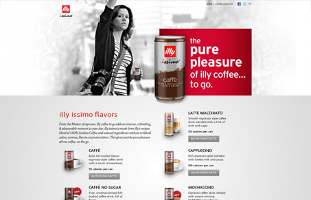
I like how the main objective of getting you to notice the cans of illy (products) is played up and beyond the other nav items on the page here. The imagery is super nice and the black and white image next to the loud red of the can is a great example of how you can use impact like this to drive your brand home in such a noticeable way.
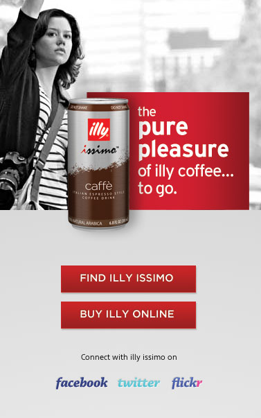
The responsive page designs are also very nicely done, I think I like the iPhone screen size best of all on this one. I also really dig how the focus changes from checking out projects to finding where you can buy the product on the handheld screen size. Smart stuff.


0 Comments