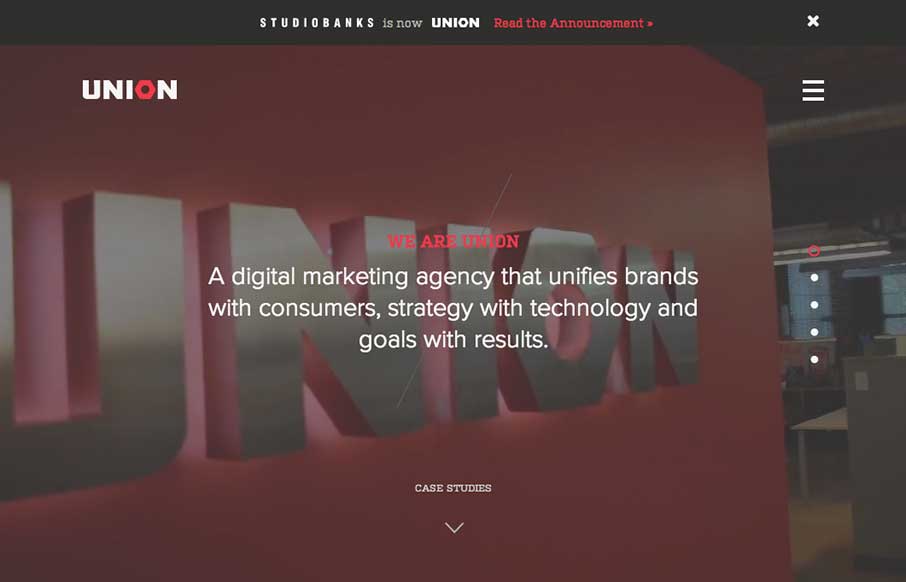
Here’s a good example of a site pretty much hiding everything except a few links to case studies/work examples under a fly out overlay nav. I gotta assume this is by design. I do like the idea of keeping most people focused on your work like this btw.
Glassmorphism: The Transparent Design Trend That Refuses to Fade
Glassmorphism brings transparency, depth, and light back into modern UI. Learn how this “frosted glass” design trend enhances hierarchy, focus, and atmosphere, plus how to implement it in CSS responsibly.


0 Comments