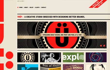
Largely imagery based this design studio’s website is quite enjoyable. I love the simple typography use here, it’s bold and works really well. The large image slideshow is full of nicely designed project previews that look engaging to me. I like the background color and how it works with the red & black used in the layout too.
Glassmorphism: The Transparent Design Trend That Refuses to Fade
Glassmorphism brings transparency, depth, and light back into modern UI. Learn how this “frosted glass” design trend enhances hierarchy, focus, and atmosphere, plus how to implement it in CSS responsibly.


Love the clean design