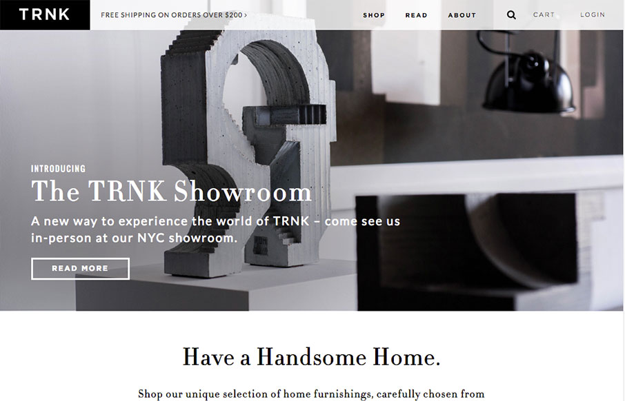
Very nice grid based layout and a design that takes advantage of that grid and escapes it for good impact lower down on the page. I love the main nav and how it fills in with the overall grid beautifully, with that mega-drop-down design. Solid work here.
Glassmorphism: The Transparent Design Trend That Refuses to Fade
Glassmorphism brings transparency, depth, and light back into modern UI. Learn how this “frosted glass” design trend enhances hierarchy, focus, and atmosphere, plus how to implement it in CSS responsibly.


0 Comments