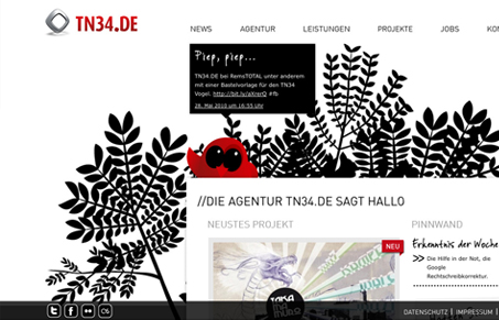
Interesting background, I like how it starts out an illustration of organic looking elements and ends up just being a black background. The little red bird illustration holding the recent tweet(s) is cute.
Glassmorphism: The Transparent Design Trend That Refuses to Fade
Glassmorphism brings transparency, depth, and light back into modern UI. Learn how this “frosted glass” design trend enhances hierarchy, focus, and atmosphere, plus how to implement it in CSS responsibly.


That bird is the cutest! I like how it gets reused on some of the subpages because it really pops on the black and white. I did wonder if their twitter feed would need to be that prominent on the homepage – that’s some prime real estate!
I also like the way the background “gradients’ to black and how the footer meshed with that.
chido