I found this site from a photographer and art director from Paris, Thierry Ambraisse, a little while back – and for some reason didn’t review it. I found it again this week, and something resonated with me, and really paid attention to the photos, the transitions, and the artistic freedom of the site. I don’t think my review can do it justice because you have to experience a lot of it to “get it” – but here are some thoughts about it.
Intro
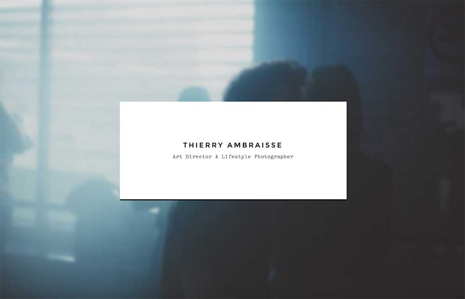
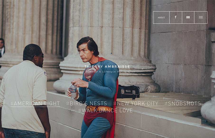
Cool fade in/ fade out on the intro text. Something that I finally saw after having to refresh a bunch of times, in order to get the screen shot of the intro – the images that come up are fairly random.
Slideshow / Transition
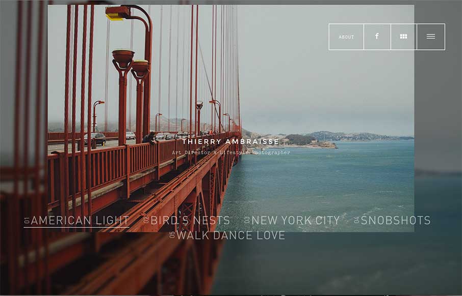
This site is kind of built on different ways of presenting Thierry’s photos, and I really love the full screen slideshow, and the transitions on this main page.
Navigation
Slideshow Navigation

Like the navigation animation / pre-loader that is totally different than most slideshows.
Grid View
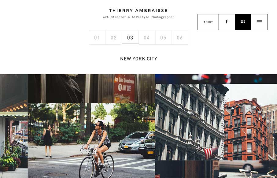
We’ve seen this kind of odd, not quite fluid grid presentation of photos on a couple of sites recently – it works on a site like this because, well, why not.
List View
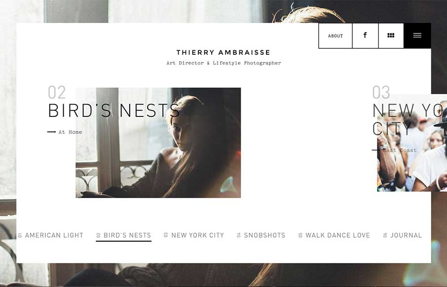
This is slider that plays off of the slideshow from the home page – with some motion on the text.
Image Detail
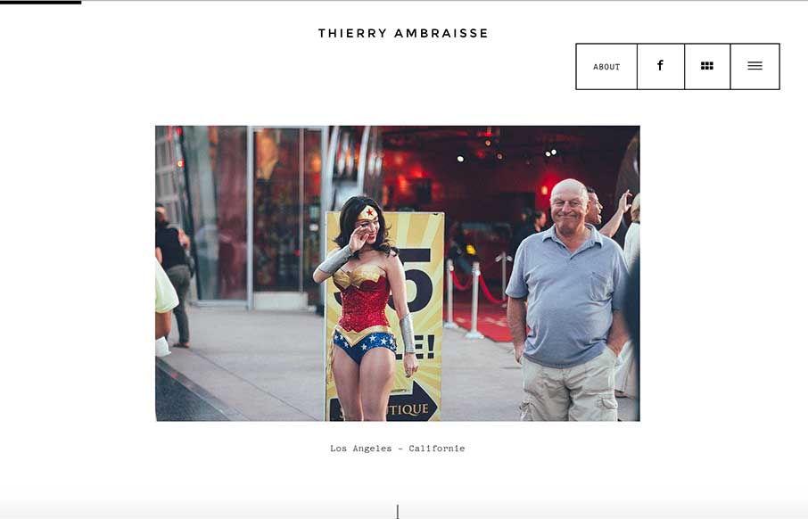
This is more like a tumblr or blog list – but note the loading header while scrolling down the page – again, have started to see this trend, especially to track where you are on the page.
About Page
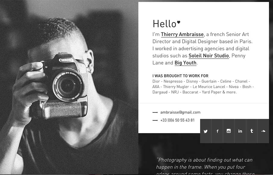
Great fly-in animation, and a solid page. (is a little hard to get out of on a smaller screen)
Better be on Desktop…
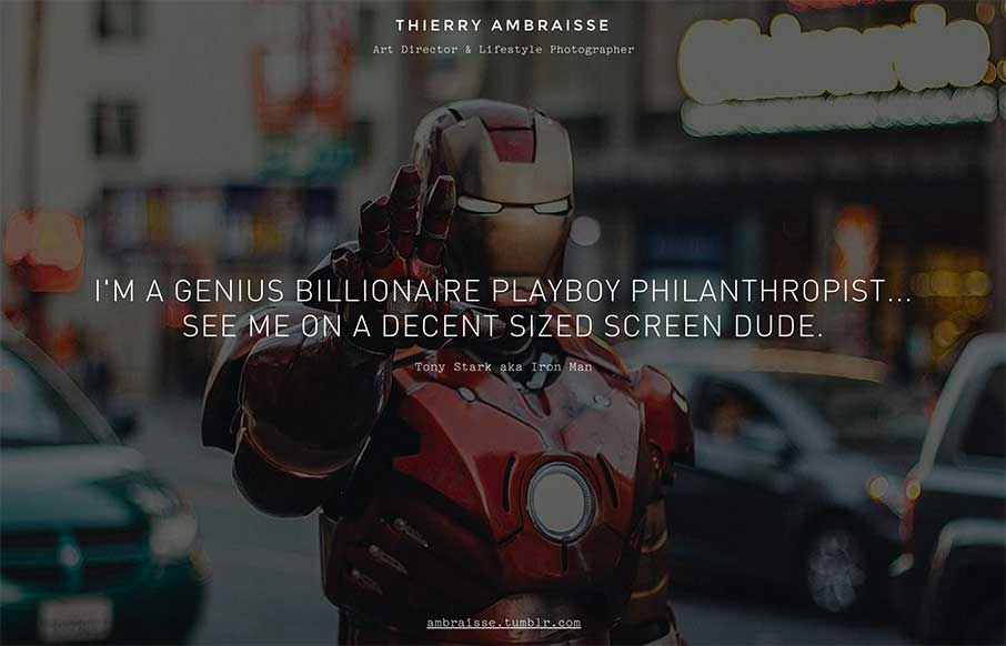
And then speaking of smaller screen – looks like this site is responsive, down to a certain width – after that, this is a fun way to keep the integrity of the experience, and avoid full responsiveness (in honor of the art – yes, I get it).
Interested in Unmatchedstyle profiling your website in-depth? Just fill out the form – “need the info” – make sure you talk a little about the design so we can quote you. We can’t guarantee it to be fully analyzed like this one, and can’t guarantee it will get reviewed (we get a lot of requests, and try to have some standards) – but we’re making this type of long form gallery post part of our weekly editorial calendar. Let us know what you think!



0 Comments