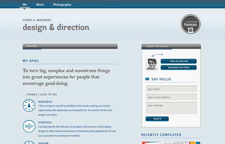
This is a really interesting looking design. It’s definitely a non-traditional layout. I really love a lot of the details like the way the portfolio pieces are showcased in the small wide graphic shape and the icons and things used for each section of copy. I also really love the way the background image down in the footer is treated too, that’s just neat looking.
Glassmorphism: The Transparent Design Trend That Refuses to Fade
Glassmorphism brings transparency, depth, and light back into modern UI. Learn how this “frosted glass” design trend enhances hierarchy, focus, and atmosphere, plus how to implement it in CSS responsibly.


0 Comments