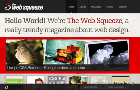
Really cool content, but it’s also a good design. I like the large feeling to the navigation elements and there is a lot of things here and there around the site that interacts in clean and interesting ways. The footer tool bar thing is also a nice touch. Some of the visual hierarchy is a little touchy on this design, for example some of the advertising elements are the same sizes as the actual slideshow elements, I could see a user not paying attention to those slideshow elements as much as they should. Love the colors and the textures on this design too. Really good work both content and design wise here.
Glassmorphism: The Transparent Design Trend That Refuses to Fade
Glassmorphism brings transparency, depth, and light back into modern UI. Learn how this “frosted glass” design trend enhances hierarchy, focus, and atmosphere, plus how to implement it in CSS responsibly.


0 Comments