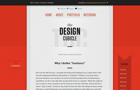
It can be hard to articulate why a design is good, or why it just works. A great design like this just is. All of the things that make this site successful are so small, so subtle as to go almost unnoticed. To start with, the type is perfectly chosen and set. I think this is as good of an advertisement for Typekit and FontFont fonts that I’ve seen. The flawlessness, even at small sizes, of FF Dagny is just astounding. Brian could have easily used Helvetica and called it a day, but it really wouldn’t have the beauty that this does. He also could have just put a drop shadow behind the main area, but instead used a subtle pattern on either side, achieving the same separation and depth that drop shadows can provide, but going in a different enough direction to be original.
The comments count line is clever, e.g. “You will be the 24th comment”. I do feel like the link in that line should go to the comment form, not the top of the comments, but that’s minor. I could keep going, but the theme of this design is about coming up with fresh, inventive and subtle tweaks to familiar elements we’ve seen on blogs for years. I expect this to be a site that will be frequently mimicked in the near future. It’s a remarkable success.


I love this site. It has a very simple layout but it has some tasty tasty details and I think that’s what makes it appealing.
simply gorgeous… it is the little details that really set this design apart.
congrats to Brian Hoff
You really get the feeling that someone agonized over picking the perfect typeface for this design. The other thing I love is the subtle hierarchy in the type layout as you scan down the page. Freaking gorgeous site!
@Unmatchedstyle and everyone else,
Thank you for the kind words on The Design Cubicle’s redesign. Really glad everyone has embraced it so well and it really means a lot hearing all of your kind words. I’ve always been a believer that great design is in typography and the tiniest of detail, so I’m glad some of my principles that I design by really stood out. Again, thank you.
This site is beautifully designed for the content. The tiny parallel line texture is much more energetic than a flat color or gradient. Lovely.
I however don’t like that the main nav links away from the site without giving any visual indication it’s going to do so. I think its great to connect all of your sites together so that we can easily get from one to the other but the fact that the main nav. is used makes it a little confusing. When I jumped to another site I felt like I had to get my bearings and it took some clicking around to get back.
The site is beautiful but I would consider giving some distinction between internal and external links.
I’m glad to see the redesign has been such a success. Brian did an incredible job with the redesign and it was a privilege for us at Paravel to provide the code.