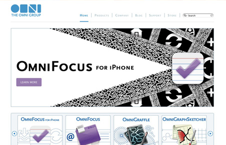
The newly launched design for The Omni Group’s website is really well done. I love how simple and clean it is, focusing strongly on the software’s various brands. The team at Blue Flavor should be congratulated on a nice looking website for a really awesome client. Check out their post on the launch.
I really love the illustrations that go into the big image area with the product icon/logo. Giving me the option to use the scroller and go to whatever product I’m interested in is a pretty simple yet elegant way to do that since Omni has so many great products.

I particularly like the breadcrumb on the sub pages.
I think the product sub page is also a nicely laid out page too. I like the visual hierarchy they’ve instilled in the design simply by using bolds and type size strategically. It’s nice to see that being done with just they text on the page and not louder design elements. The other buttons and design elements on the pages aren’t overpowering either and the images/screen shots look to be really well thought out selections.
In short I love this new design. It’s not flashy, over the top or just overly designed but it’s good solid layout and design that really puts the content first, just what Omni software does.
Here’s the note from Omni’s Blog about the re-launch:
Our main goal was to re-engineer the site so that even us non-technical folks could update it, and if you’re interested in the behind the scenes stuff, it’s running on Expression Engine. The secondary goal was to spruce up the content and make everything, you know, shinier. A big public thank you needs to go out to our graphics guru, Grayson West, and web-ninjas-for-hire, Blue Flavor, for working through endless revisions and not throttling anyone during the process.


0 Comments