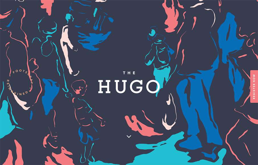
Pretty clever use of the background image. I really like how it’s used as the hero area image, then you scroll down and the rest of the site kind of slides up. I like the register button and how it works too. Pretty cool 80’s inspired colors too.
Glassmorphism: The Transparent Design Trend That Refuses to Fade
Glassmorphism brings transparency, depth, and light back into modern UI. Learn how this “frosted glass” design trend enhances hierarchy, focus, and atmosphere, plus how to implement it in CSS responsibly.


0 Comments