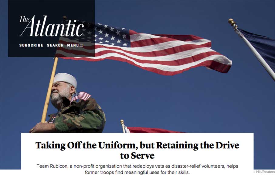
The layout of The Atlantic is insanely simple. In many ways it mimics such things as say Instagram. It keeps me intrigued with headline after headline and super great photo after photo. I love this, just sitting here scrolling and reading and looking. Thing does it’s job well, that’s for sure!
Glassmorphism: The Transparent Design Trend That Refuses to Fade
Glassmorphism brings transparency, depth, and light back into modern UI. Learn how this “frosted glass” design trend enhances hierarchy, focus, and atmosphere, plus how to implement it in CSS responsibly.


love the pictures as well. keeps you in