
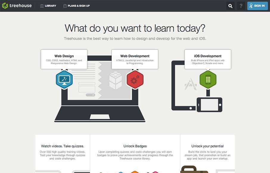
Really tight design for the Treehouse website. I love the main graphic with the interactions that make the other elements on the illustration disappear. They work really well to pull you in deeper into the chosen section. I equally like the fixed header and how it’s used across the home page, sub pages and once you’re logged in. Everything looks really snappy visually too, which is needed to help make you trust the service more and it doesn’t disappoint either.


Fitts’s Law: Why the Easy Button Wins
Large, close targets are faster to hit than small, distant ones, that’s Fitts’s Law. A look at the 1954 rule behind buttons, prime and magic pixels, thumb zones, and dark patterns.


Hi Gene, we agree – this design provides a very inviting feeling. On their About Page, they have a “counter” that shows just HOW good their stuff is. Last I checked, they had over 12,000 subscribers and growing month over month. I highly recommend them to anyone looking for a new career path! Great post!