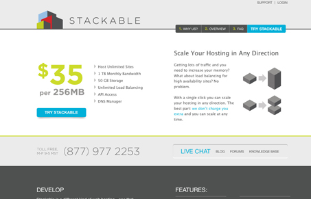
I can’t decide whether the austerity of this site is to it’s detriment or not. I really like that it’s a departure from the average busy and blinged out site for most hosting companies. On the other hand, there are some large areas of white-space that just seem a bit empty, and when you drill down some of the pages feel like they just need a little more attention. It would probably help if the logo was bigger (yes, make the logo bigger), and maybe had just a little bit of depth and came into that large area right under it. That would help fill the space and break up some of the horizontals to bring the eye down the page.


I love the friendly, flat colors and simplistic elements in this site. I’m not as much bothered by the white space like Jay. I think it’s more refreshing and I feel like I can take my time looking at what’s there. I could understand the idea of breaking up some of the horizontal lines.
I also disagree on making the logo bigger. I love that logo just as it is. The main problem I have with the site is the complete inconsistency with all the different subpage designs and navigation.