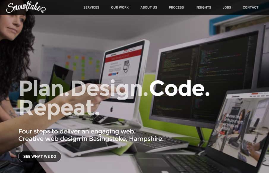
Oooh! I love the way the background images in the hero area(s) of this page get some faux 3d movement. That’s very smart and I don’t think i’ve seen that before. What a way to make the site different than the rest. Bravo.
Glassmorphism: The Transparent Design Trend That Refuses to Fade
Glassmorphism brings transparency, depth, and light back into modern UI. Learn how this “frosted glass” design trend enhances hierarchy, focus, and atmosphere, plus how to implement it in CSS responsibly.


I have never been a big fan of sites that the first thing you see is “loading,” even if it is beautiful. Though it may be a good use of a hero image, the site itself seems a little sluggish on a desktop.
Hey Aaron – in some ways I agree. I was just starting to writing a post about a different site that has some subtle parallax and animation features, but isn’t flashy, and is almost all css instead of realistic images – and I thought, you know, that works too. I think that when we review the sites, we highlight what’s cool an innovative about them and don’t really point out their faults (yes, it is sluggish looking at it again). However – I think sites like this give us an idea of how awesome our work can and will be in the near future, and gives us reason to find ways to, as a community, solve issues of speed and mass in our designs. If this isn’t the case, that first crappy website I coded in 1997 for $250 would have probably have been the pinnacle of my web design career (and it was for a golf company – so I through a pun in there…) – Noted, now go figure out a way to make it better please!