
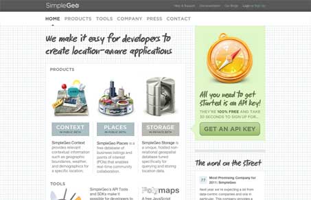
The first thing you notice is that those icons/illustrations are just out of control. They look so freaking cool. The site design itself is also well done and clean even though the background is an actual grid, it just works – especially with the product’s concept. I like the clear distinction they’ve given the three main aspects of the application too; context, places and storage, I find it quite easy to digest. The other thing that’s really great about this site is the copy, it’s very easy to digest and written very well. Take the tagline for example “We make it easy for developers to create location-aware applications.” That really says it all in one quick sentence, not easy to do.




0 Comments