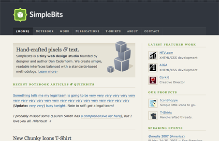
Dan Cedarholm is without a doubt one of the most influential Web designers out there. SimpleBits is an icon—no pun intended—of a generation set on creating a new way to look at the Web. Through books, speaking engagements, and various online articles, Dan manages to continue to woo us with his creative style and knack for a great layout.
My favorite part is the layout. It’s your standard two-column approach to the blog, but adds Dan’s flavor. The best part of the layout is that it maintains itself as you increase or decrease the font-size. SimpleBits has undergone a few key redesigns, but none were as drastic as this one, done a few months back. It took the focus off of Dan’s previous work and put it back onto his current engagements as a blogger, designer, and speaker. The focus on the blog entries and studio work in the layout’s main column gets that job done with relative ease.
Granted SimpleBits’ latest design isn’t that new, the design itself is sure to be a classic example of how a great, scalable grid and some attention to graphical details can make a design all the better.


0 Comments