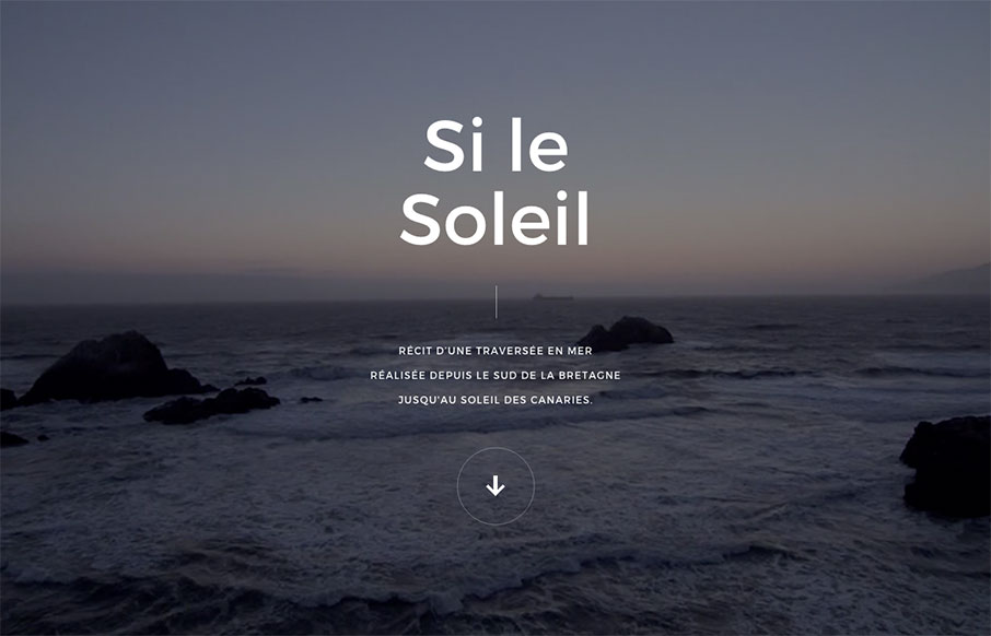
Pretty crazy site design. I love the animated interactions and imagery and stuff. It’s also pretty rad that they were able to keep it pretty much intact on smaller mobile screen widths too. Check out that nav design too, pretty intense but super rewarding on desktop.
Glassmorphism: The Transparent Design Trend That Refuses to Fade
Glassmorphism brings transparency, depth, and light back into modern UI. Learn how this “frosted glass” design trend enhances hierarchy, focus, and atmosphere, plus how to implement it in CSS responsibly.


0 Comments