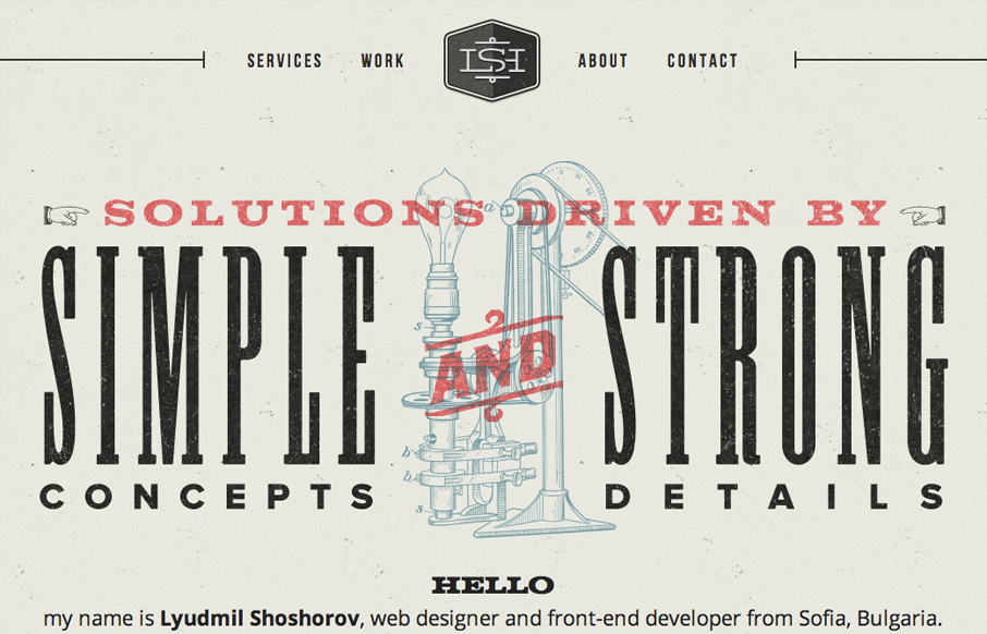
This one pager has a really nice aesthetic to it. It comes standard with the usual suspects: good (typography, use of color, texture). I like the couple of small animated elements such as the portfolio brain loader and auto-advancing services. I feel like some consideration was missed in the layout though. Looking at the site on my 15″ laptop doesn’t leave sufficient room to see the complete vertical sections and it makes browsing through the portfolio details cumbersome. Also, I’m not sure why ‘about’ and ‘contact’ are 2 separate nav links when they’re joined into one section in the page content. Aside from that though, the visual elements of the site are executed well.


The Call to Action, Revisited
The Call to Action hasn’t changed in a decade, but the bar has. A fresh look at prominence, copy, mobile tap targets, and accessibility, with lessons from three major design systems.


0 Comments