
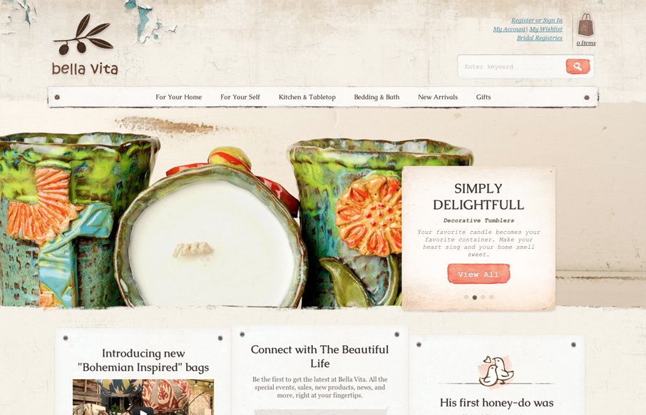
What I like most about the Bella Vita website is the consistency that the textures and colors are used. I love that search button, the same esthetic is echoed throughout the site’s details too, like on the back and next interactions on the slideshow. The main navigation also has some rather nice “mega” drop-down action going on too. The site is also a responsive beauty. Great website here.


Fitts’s Law: Why the Easy Button Wins
Large, close targets are faster to hit than small, distant ones, that’s Fitts’s Law. A look at the 1954 rule behind buttons, prime and magic pixels, thumb zones, and dark patterns.


0 Comments