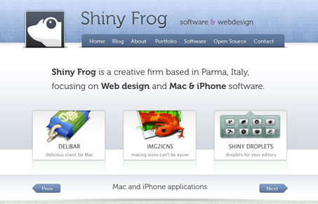
I like the tiny detail in this design. The modular icon pieces are also really well done. The subdued color palette also allows the work samples to pop out really well. The contact form is also a really interesting design.
Glassmorphism: The Transparent Design Trend That Refuses to Fade
Glassmorphism brings transparency, depth, and light back into modern UI. Learn how this “frosted glass” design trend enhances hierarchy, focus, and atmosphere, plus how to implement it in CSS responsibly.


0 Comments