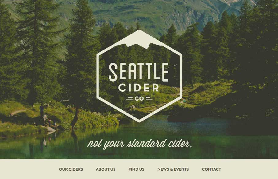
The Seattle Cider Company website uses flat illustrations and simple interactions to control the narrative of the cider making process. The design style is hip and minimal with a few nifty tricks (like the slide-in fixed nav) and a lot of character.
The narrative step-by-stop process description is my favorite part of the site. It’s long and viewing the text boxes is a little fidgety (at least in Chrome), but the look is great and the illustrations do a great job of explaining the cider making process.


0 Comments