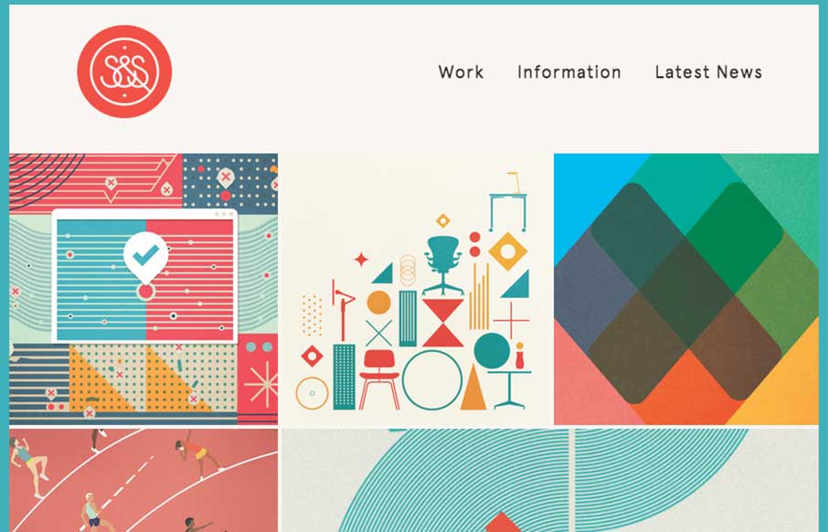
Nice Masonry/Isotope type responsive effect here. Actually, digging into the code looks like it is Isotope… I like the usage of it here because it just feels a little different. Especially with the way the logo overlays on top of the images like that too as you scroll. Cool site.
Glassmorphism: The Transparent Design Trend That Refuses to Fade
Glassmorphism brings transparency, depth, and light back into modern UI. Learn how this “frosted glass” design trend enhances hierarchy, focus, and atmosphere, plus how to implement it in CSS responsibly.


0 Comments