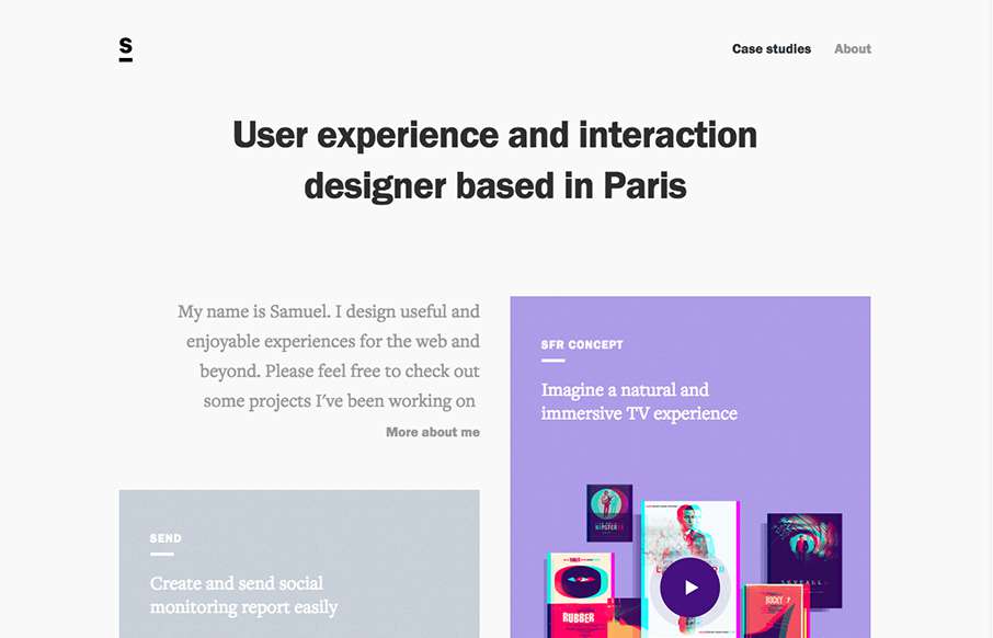
I really like how designers are putting some time into their portfolios, and especially the case study parts – like how Samuel Medvedowsky’s Work Portfolio pages use both full and “fixed” width to tell his stories. More so than that, it’s great to get insight into how designers do what they do, and the thought process behind it.
Glassmorphism: The Transparent Design Trend That Refuses to Fade
Glassmorphism brings transparency, depth, and light back into modern UI. Learn how this “frosted glass” design trend enhances hierarchy, focus, and atmosphere, plus how to implement it in CSS responsibly.


0 Comments