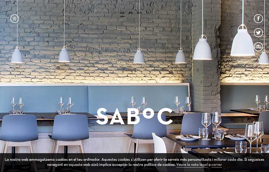
Cool site design. I like the vibe of this single pager. The hamburger icon is in play here, but it’s really just for anchors along the page. Nice use of that in this instance IMHO.
Glassmorphism: The Transparent Design Trend That Refuses to Fade
Glassmorphism brings transparency, depth, and light back into modern UI. Learn how this “frosted glass” design trend enhances hierarchy, focus, and atmosphere, plus how to implement it in CSS responsibly.


Crystal clarity site define the means of fantastic !