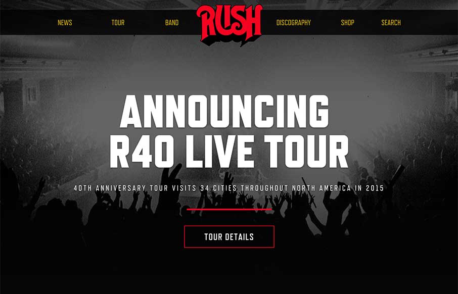
Pretty dang nice website for a classic band. I love the header/logo and how it moves a bit as you scroll. It stays “maximized” as you make your way past the hero image area and then gets much smaller as you go past it. Smart stuff. There’s other little movement and interaction to keep you interested. It’s been a while since i’ve seen and all-black background website like this that looked as great. It’s just down-and-dirty good design that’s all.


The Call to Action, Revisited
The Call to Action hasn’t changed in a decade, but the bar has. A fresh look at prominence, copy, mobile tap targets, and accessibility, with lessons from three major design systems.


0 Comments