Submitted by: Ryan O’Rourke @rourkery
Role: Designer & Developer
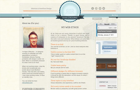
This is the 3.0 reiteration of my portfolio/blog. Over arching idea was for better readability. I dig it, anyway. Cheers!
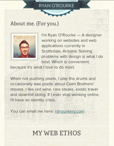
Ryan should dig his site because it achieves his goal of readability by providing good fonts with high-contrast with a logical layout. Behind that is just enough texture and softness to keep it from being sterile. There are really only two pages (home and work), but it doesn’t feel like anything is missing.
Ryan has also made this a responsive site and it works well and looks sharp when viewed on a smaller screen. It’s possible that the smallest size goes a little too far in hiding the social icons and work links but otherwise it’s commendable.


0 Comments