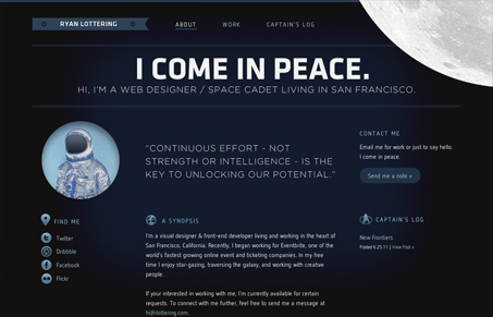
Ryan Lottering’s personal site is nice, simple and does a good job of showing off his work. It took me a second to notice the subtle animation. It’s so subtle it’s almost an easter egg so I won’t spoil it for anybody reading this. Just go check it out. The type is well chosen and is a perfect fit to the feel of the site. It would be nice if it wasn’t partially set in images, but I’m sure it was a reasoned choice.


0 Comments