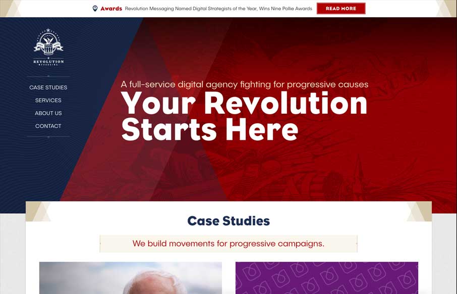
You’ve got to love commitment to a good theme. The Revolution Messaging website delivers on that in such a solid way. I love almost every detail of this website. The way it loads items as you get down the page and the way there are tiny little interactions baked into the page on mouse-overs.
Glassmorphism: The Transparent Design Trend That Refuses to Fade
Glassmorphism brings transparency, depth, and light back into modern UI. Learn how this “frosted glass” design trend enhances hierarchy, focus, and atmosphere, plus how to implement it in CSS responsibly.


0 Comments