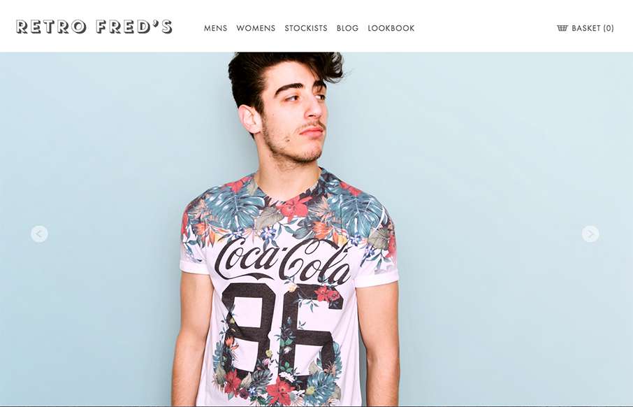
I like the simplicity in the grid for this ecommerce site. It’s clean and simple and driven by the photography. I really like the way the main navigation is displayed open when you load it up on the mobile site width like that too. Smart stuff.
Glassmorphism: The Transparent Design Trend That Refuses to Fade
Glassmorphism brings transparency, depth, and light back into modern UI. Learn how this “frosted glass” design trend enhances hierarchy, focus, and atmosphere, plus how to implement it in CSS responsibly.


0 Comments