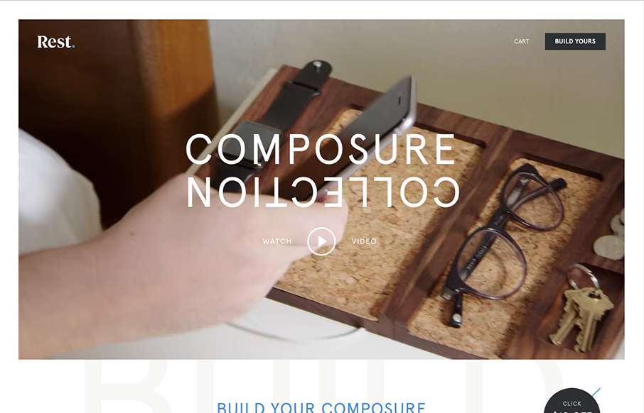
Everything has it’s place. Just like with the product the website for the product has the same vibe and tone. I like the way they show off each different type of product and when you hover over them you can see people’s stuff on it. The website is very clean and vibrant at the same time. Great looking product and website.
Glassmorphism: The Transparent Design Trend That Refuses to Fade
Glassmorphism brings transparency, depth, and light back into modern UI. Learn how this “frosted glass” design trend enhances hierarchy, focus, and atmosphere, plus how to implement it in CSS responsibly.


0 Comments