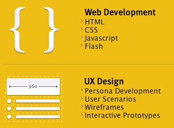
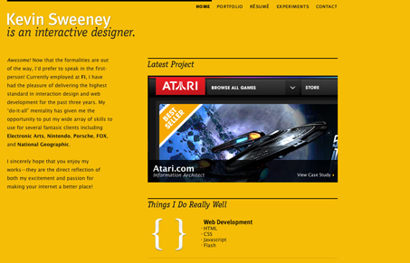
Love the orange and black, but orange with the radial gradient in the background is nice. The overall design is simple in it’s layout but there’s a lot of detail put into each of the smaller graphical elements, like the “things I do really well” area and then again in the portfolio details.


0 Comments