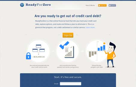
Nice open looking design. The colors chosen here work well together and support the idea of the product too I think. Also keeping the call to action links/buttons visually together in sharing the orange makes them stand out really loudly against the overly blue and tan site. I do think that the design pushes the limit on putting forward just enough info to convince you to try the app and not enough info. My gut tells me that the main call to action should be “learn more” instead of just “sign up”. I don’t have any data or real reason other than I was actively looking around the page to find more info. Sort of the 37signals model where users want more info first, then want to sign up second. Overall though the site looks very trustworthy and convincing that the folks behind the site are solid and that’s always the biggest hurtle.


0 Comments