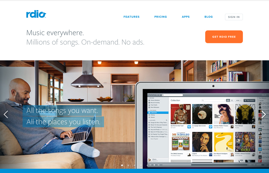
The new(ish) rdio.com design is beautiful. I love the visual engagement that the design drives you into as you make your way down the hierarchy of the page. From light to dark, from sparse to dense it’s very well put together. I think the colors get so much better and interesting as you scroll down, the blue and orange on the topmost section are a little blah, but overall as a whole the site design is just classic. Well done indeed!


The Call to Action, Revisited
The Call to Action hasn’t changed in a decade, but the bar has. A fresh look at prominence, copy, mobile tap targets, and accessibility, with lessons from three major design systems.


0 Comments