
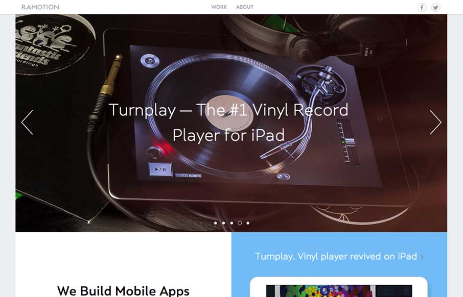
What a nice minimal(ish) design approach. If I were to think about what a site for a company that designs apps/icons this is what i’d hope I’d come up with. Beautiful sections and simplified nav choices make this site super easy and laid back feeling while being sharp and very pro.


Fitts’s Law: Why the Easy Button Wins
Large, close targets are faster to hit than small, distant ones, that’s Fitts’s Law. A look at the 1954 rule behind buttons, prime and magic pixels, thumb zones, and dark patterns.


0 Comments