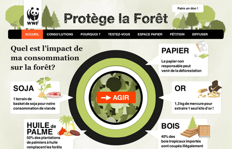
I really dig this home page, the big bullseye with the mouse over interactions on the call out boxes is nicely done. I love how the subpages continue this same look with the callout too.
Glassmorphism: The Transparent Design Trend That Refuses to Fade
Glassmorphism brings transparency, depth, and light back into modern UI. Learn how this “frosted glass” design trend enhances hierarchy, focus, and atmosphere, plus how to implement it in CSS responsibly.


0 Comments